Betway USA Search
Betway USA Search
Betway USA Search
As Betway expanded into the US, we were tasked with redesigning the whole app with a fresh look and experience. An important part of this was an enhancement to the search capabilities of the app.
As Betway expanded into the US, we were tasked with redesigning the whole app with a fresh look and experience. An important part of this was an enhancement to the search capabilities of the app.
As Betway expanded into the US, we were tasked with redesigning the whole app with a fresh look and experience. An important part of this was an enhancement to the search capabilities of the app.
Role
Role
Role
UXUI Designer
UXUI Designer
UXUI Designer
Employer
Employer
Employer
Derivco Sports
Derivco Sports
Derivco Sports
Platforms
Platforms
Platforms
IOS & Android
IOS & Android
IOS & Android
My Role
My Role
My Role
Planning, Research, Testing, Design
Planning, Research, Testing, Design
Planning, Research, Testing, Design

Background
Background
I was chosen to lead the project, designing the new search experience for users to find athletes, clubs, leagues, and casino games.
I was chosen to lead the project, designing the new search experience for users to find athletes, clubs, leagues, and casino games.
I was chosen to lead the project, designing the new search experience for users to find athletes, clubs, leagues, and casino games.
To understand who our users were and the issues they faced with the existing search, I conducted user testing with American sportsbook users and analysed previously collected CSAT survey feedback. This revealed three key insights:
Users fell into seven personas, with the most common being the Casual Bettor, Recreational Sports Fan, and Professional Gambler.
Multiple entry points into the search flow caused confusion.
The original search layout didn’t meet US market expectations (e.g. incorrect odds format, titles, and layout).
To understand who our users were and the issues they faced with the existing search, I conducted user testing with American sportsbook users and analysed previously collected CSAT survey feedback. This revealed three key insights:
Users fell into seven personas, with the most common being the Casual Bettor, Recreational Sports Fan, and Professional Gambler.
Multiple entry points into the search flow caused confusion. The original search layout didn’t meet US market expectations (e.g. incorrect odds format, titles, and layout).
To understand who our users were and the issues they faced with the existing search, I conducted user testing with American sportsbook users and analysed previously collected CSAT survey feedback. This revealed three key insights:
Users fell into seven personas, with the most common being the Casual Bettor, Recreational Sports Fan, and Professional Gambler.
Multiple entry points into the search flow caused confusion.
The original search layout didn’t meet US market expectations (e.g. incorrect odds format, titles, and layout).

An affinity map created during a team meeting to discuss and analyse initial research results
An affinity map created during a team meeting to discuss and analyse initial research results
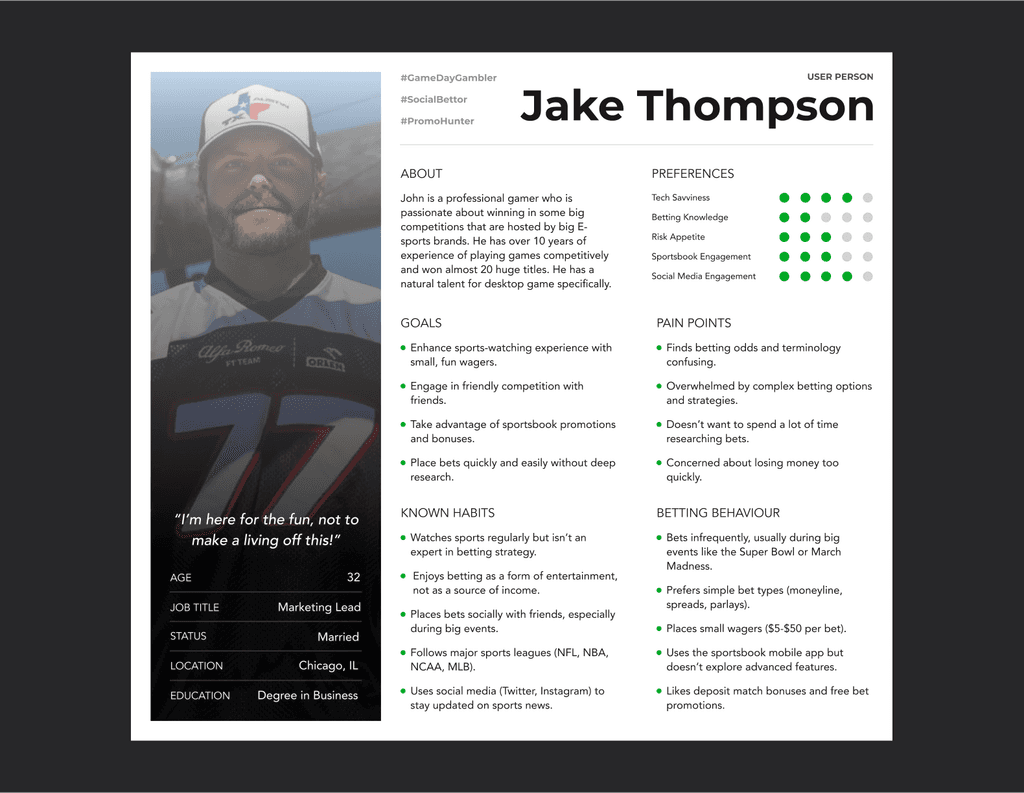
The casual sports betting fan was one of the most common personas of the 7 we identified during initial research
The casual sports betting fan was one of the most common personas of the 7 we identified during initial research

I created a range of user stories, backed by initial research insights and the personas we developed
I created a range of user stories, backed by initial research insights and the personas we developed
Competitor Research
Competitor Research
After gaining a clear understanding of user pain points in the existing search flow, I turned my attention to how competitors approached the search experience. While the overall journey remained similar across platforms, key UI patterns and features stood out:
After gaining a clear understanding of user pain points in the existing search flow, I turned my attention to how competitors approached the search experience. While the overall journey remained similar across platforms, key UI patterns and features stood out:
After gaining a clear understanding of user pain points in the existing search flow, I turned my attention to how competitors approached the search experience. While the overall journey remained similar across platforms, key UI patterns and features stood out:
Twitter used a mega menu to surface trending topics and categories.
Google and Instagram both displayed recent searches and live suggestions.
Instagram also allowed users to filter results by content type, a useful feature given Betway's multiple search categories (e.g., player, team, competition, casino).
These insights highlighted opportunities to introduce more intuitive filtering and predictive behaviour. The depth of data available through our API would ultimately shape which patterns we could implement effectively.
These insights highlighted opportunities to introduce more intuitive filtering and predictive behaviour. The depth of data available through our API would ultimately shape which patterns we could implement effectively.
These insights highlighted opportunities to introduce more intuitive filtering and predictive behaviour. The depth of data available through our API would ultimately shape which patterns we could implement effectively.
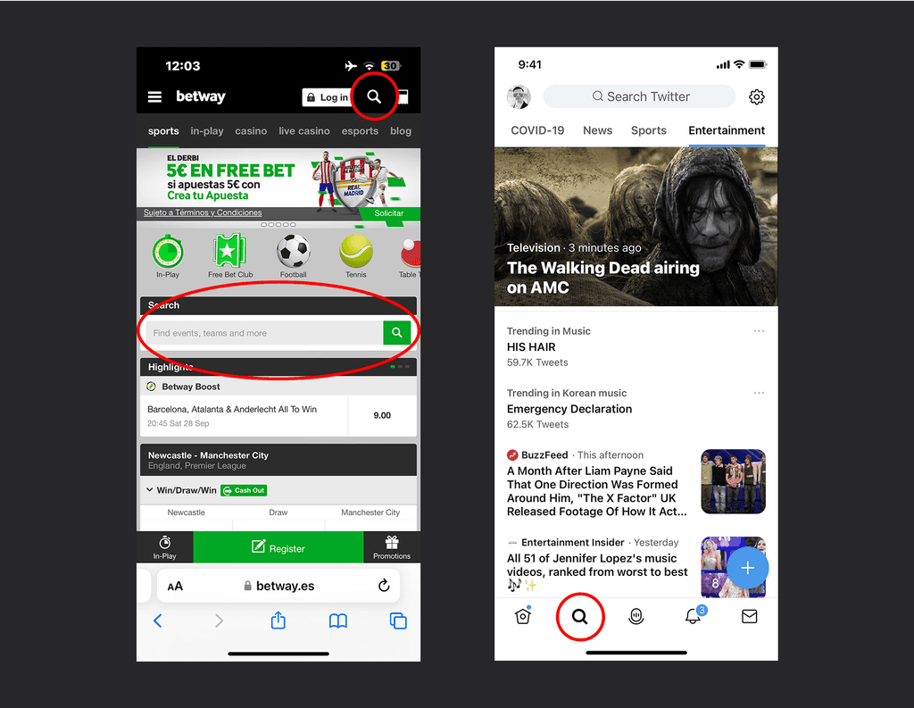
The Betway app has two entry points to the same search page, while Twitter uses a single find menu.
The Betway app has two entry points to the same search page, while Twitter uses a single find menu
The Betway app has two entry points to the same search page, while Twitter uses a single find menu

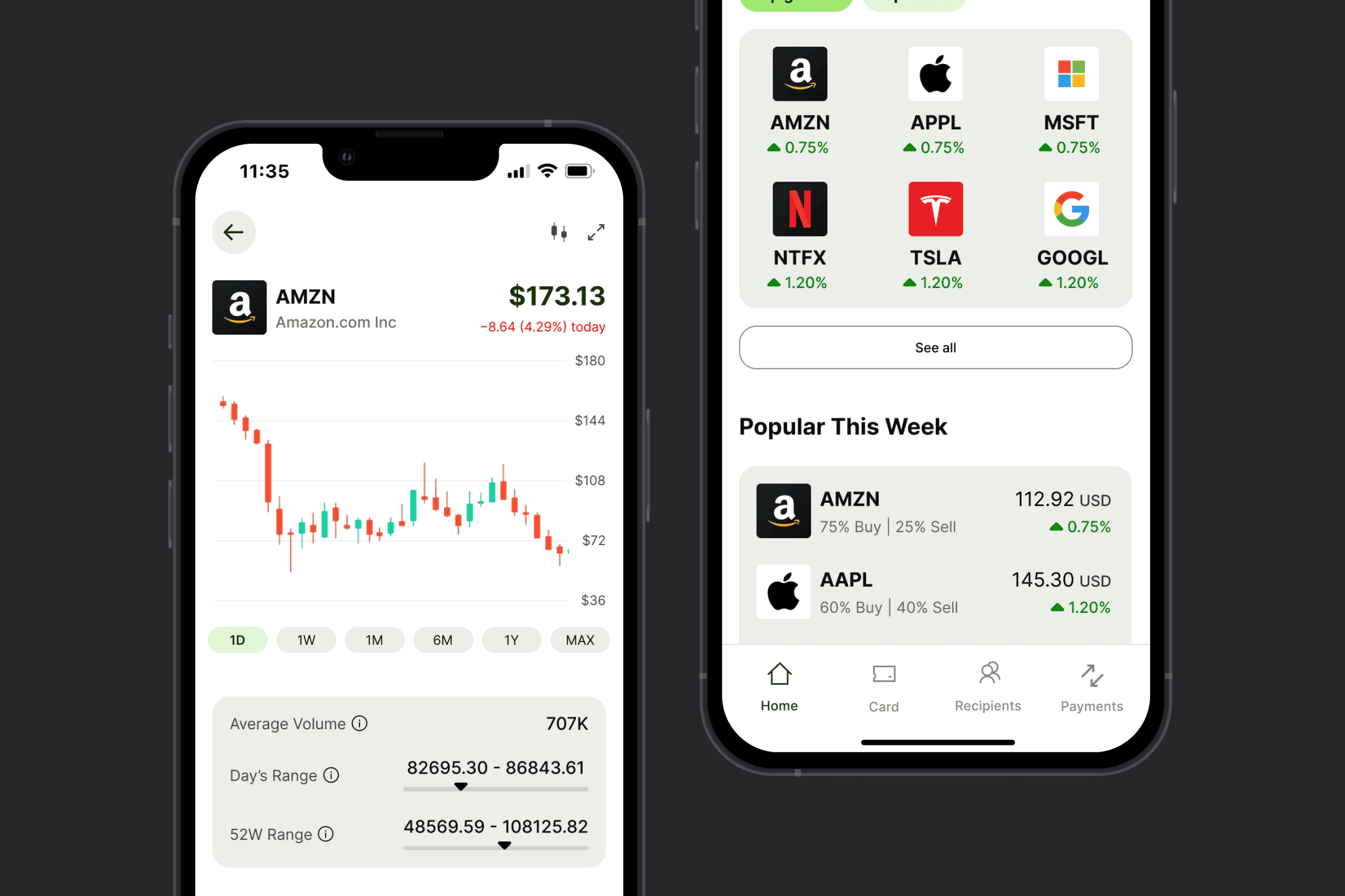
Unlike FanDuel, Betway’s odds layout did not align with the expectations of users in the US
Unlike FanDuel, Betway’s odds layout did not align with the expectations of users in the US

User journey map informed by research, illustrating the typical user flow observed across key competitors
User journey map informed by research, illustrating the typical user flow observed across key competitors
Wireframes
Wireframes
Once the core features had been prioritised through stakeholder discussions, I moved into the wireframing phase. I explored multiple layout variations to test how best to incorporate key elements such as filtering, recent searches, and predictive suggestions. These wireframes served as a foundation for validating ideas early on, allowing me to present and refine solutions quickly based on feedback from both stakeholders and the wider product team.
Once the core features had been prioritised through stakeholder discussions, I moved into the wireframing phase. I explored multiple layout variations to test how best to incorporate key elements such as filtering, recent searches, and predictive suggestions. These wireframes served as a foundation for validating ideas early on, allowing me to present and refine solutions quickly based on feedback from both stakeholders and the wider product team.
Once the core features had been prioritised through stakeholder discussions, I moved into the wireframing phase. I explored multiple layout variations to test how best to incorporate key elements such as filtering, recent searches, and predictive suggestions. These wireframes served as a foundation for validating ideas early on, allowing me to present and refine solutions quickly based on feedback from both stakeholders and the wider product team.

Exploring different UI solutions for presenting suggested search topics to the user
Exploring different UI solutions for presenting suggested search topics to the user

Quick mock-ups of how the search results could be presented to the user, inspired by competitor research
Quick mock-ups of how the search results could be presented to the user, inspired by competitor research
User Testing
User Testing
To validate my ideas for the search journey, I ran usability tests with 10 regular sportsbook users via UserTesting.com. The sessions covered the full flow—from opening search on the home screen to finding specific results. Based on the feedback, I refined the wireframes to reduce friction, introducing various result types for matches, bets, player profiles, and more.
To validate my ideas for the search journey, I ran usability tests with 10 regular sportsbook users via UserTesting.com. The sessions covered the full flow—from opening search on the home screen to finding specific results. Based on the feedback, I refined the wireframes to reduce friction, introducing various result types for matches, bets, player profiles, and more.
To validate my ideas for the search journey, I ran usability tests with 10 regular sportsbook users via UserTesting.com. The sessions covered the full flow—from opening search on the home screen to finding specific results. Based on the feedback, I refined the wireframes to reduce friction, introducing various result types for matches, bets, player profiles, and more.
To make results easier to recognise, I added sport-specific icons using a new API—helmets for American football, jerseys for basketball and football, and more. I also created fallback versions of each icon to display in case of any issues with the API data. In testing, 90% of users understood all icons, and the remaining 10% missed only one.
To make results easier to recognise, I added sport-specific icons using a new API—helmets for American football, jerseys for basketball and football, and more. I also created fallback versions of each icon to display in case of any issues with the API data. In testing, 90% of users understood all icons, and the remaining 10% missed only one.
To make results easier to recognise, I added sport-specific icons using a new API—helmets for American football, jerseys for basketball and football, and more. I also created fallback versions of each icon to display in case of any issues with the API data. In testing, 90% of users understood all icons, and the remaining 10% missed only one.

This is the search flow used during user testing
This is the search flow used during user testing

Examples of direct feedback collected from participants during user testing
Examples of direct feedback collected from participants during user testing

The top row shows each of the default icons tested, and the bottom row illustrates the icons provided by the API
The top row shows each of the default icons tested, and the bottom row illustrates the icons provided by the API
The Launch
The Launch
The refined final design for the search flow was successfully launched as part of the new Betway app rollout across the USA and Canada, reaching over 2 million active users within the first few months. User testing on the live app revealed a significant improvement in the search experience, with a 30% reduction in time spent searching for bets. This successful launch not only streamlined the process of searching and placing bets but also enhanced overall user satisfaction across both regions by making content easier to find.
The refined final design for the search flow was successfully launched as part of the new Betway app rollout across the USA and Canada, reaching over 2 million active users within the first few months. User testing on the live app revealed a significant improvement in the search experience, with a 30% reduction in time spent searching for bets. This successful launch not only streamlined the process of searching and placing bets but also enhanced overall user satisfaction across both regions by making content easier to find.
The refined final design for the search flow was successfully launched as part of the new Betway app rollout across the USA and Canada, reaching over 2 million active users within the first few months. User testing on the live app revealed a significant improvement in the search experience, with a 30% reduction in time spent searching for bets. This successful launch not only streamlined the process of searching and placing bets but also enhanced overall user satisfaction across both regions by making content easier to find.


More Projects
More Projects
More Projects

Tom Cree
Tom Cree.
tcreeux@gmail.com
©2025 TOM CREE. ALL RIGHT RESERVED
Tom Cree
Tom Cree.
tcreeux@gmail.com
©2025 TOM CREE. ALL RIGHT RESERVED
Tom Cree
Tom Cree.
tcreeux@gmail.com
©2025 TOM CREE. ALL RIGHT RESERVED
Tom Cree
Tom Cree.
tcreeux@gmail.com
©2025 TOM CREE. ALL RIGHT RESERVED